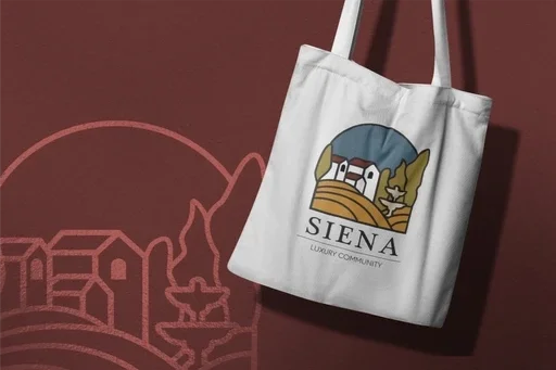
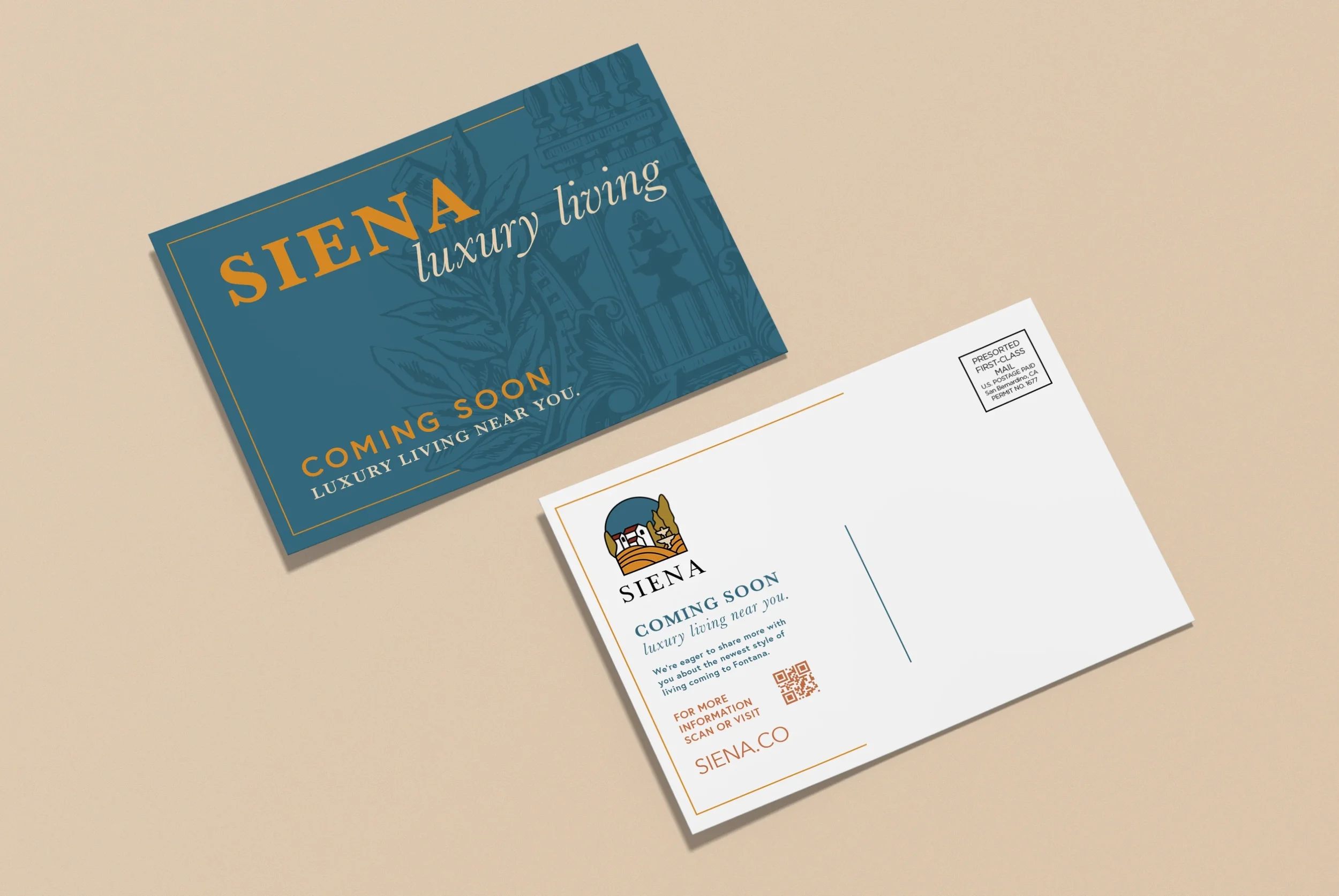
Siena
Romanesque Inspired Luxury Living.

Siena
Creating a brand that captures the essence of Tuscany, for a luxurious, close-knit community.
Branding • Design • Motion
Bringing Tuscany to California
From naming to branding to print, Mind & Mill provided Siena with a detailed, researched experience of our comprehensive, top-to-bottom branding.

Naming
For this luxury apartment complex, we were tasked with ideating four names for separate entities of one whole; we needed to name the overarching complex, and the three sub-adjacent community names. Each name needed to be unique in its own way while also being part of a whole.
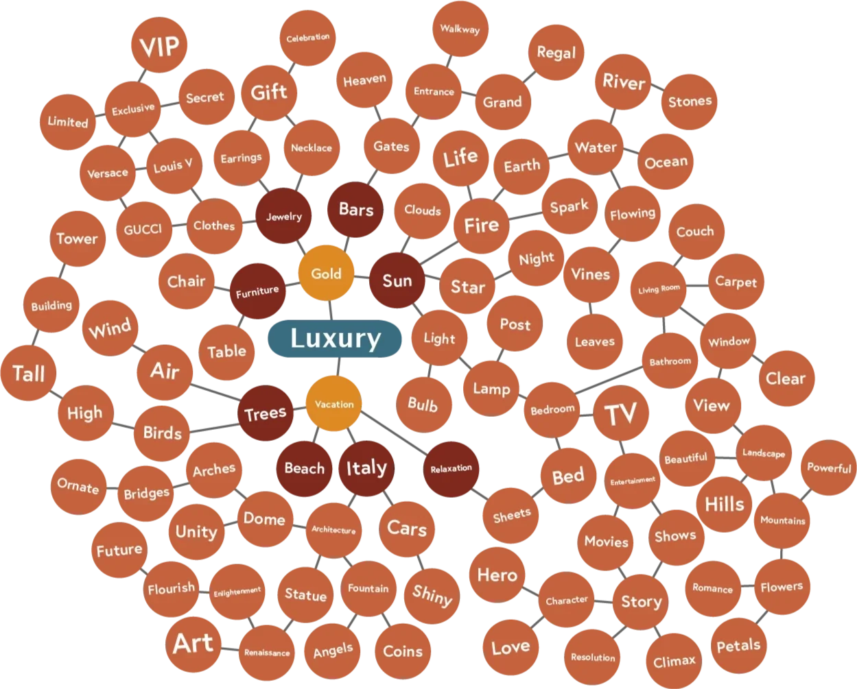
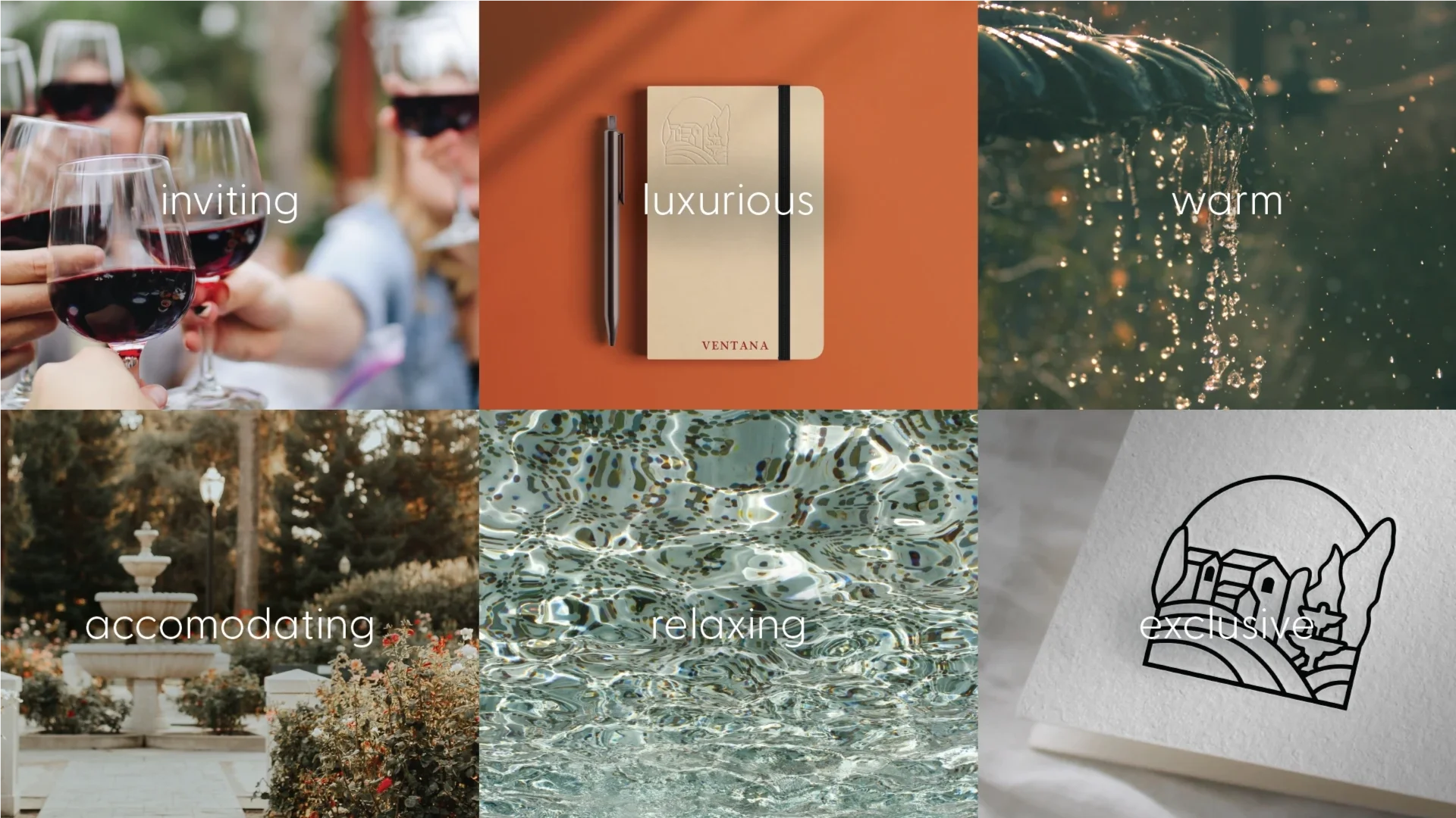
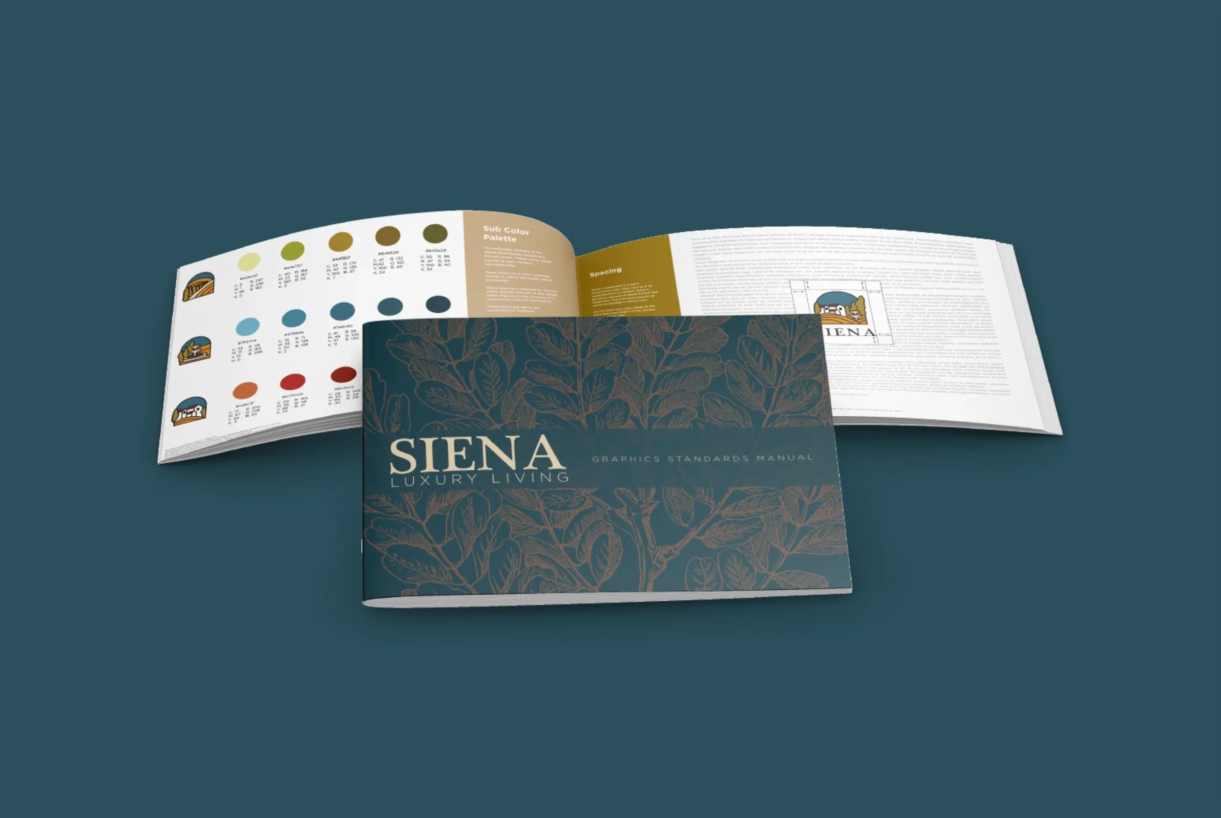
Delving into the naming process we started with considering the key tone words, identifying words that would be evocative of the brand and the community. Starting with a larger word map that then helped us identify six main tone words. We spent 20+ hours researching and ideating 200+ names from a variety of categories: landmark, ancient Rome, other languages, and more, finally landing on a name fit for the community: Siena. It has a few meanings, and we best associated it with both lush orange-red color, and the City of Siena in Tuscany, Italy.


Building a brand
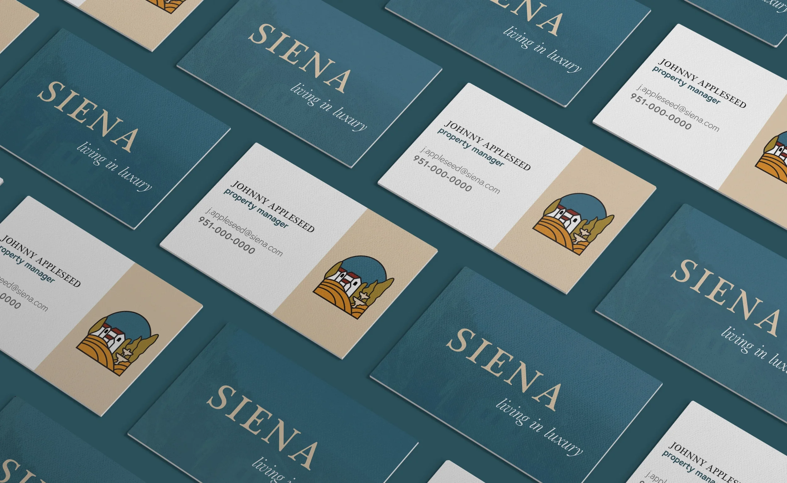
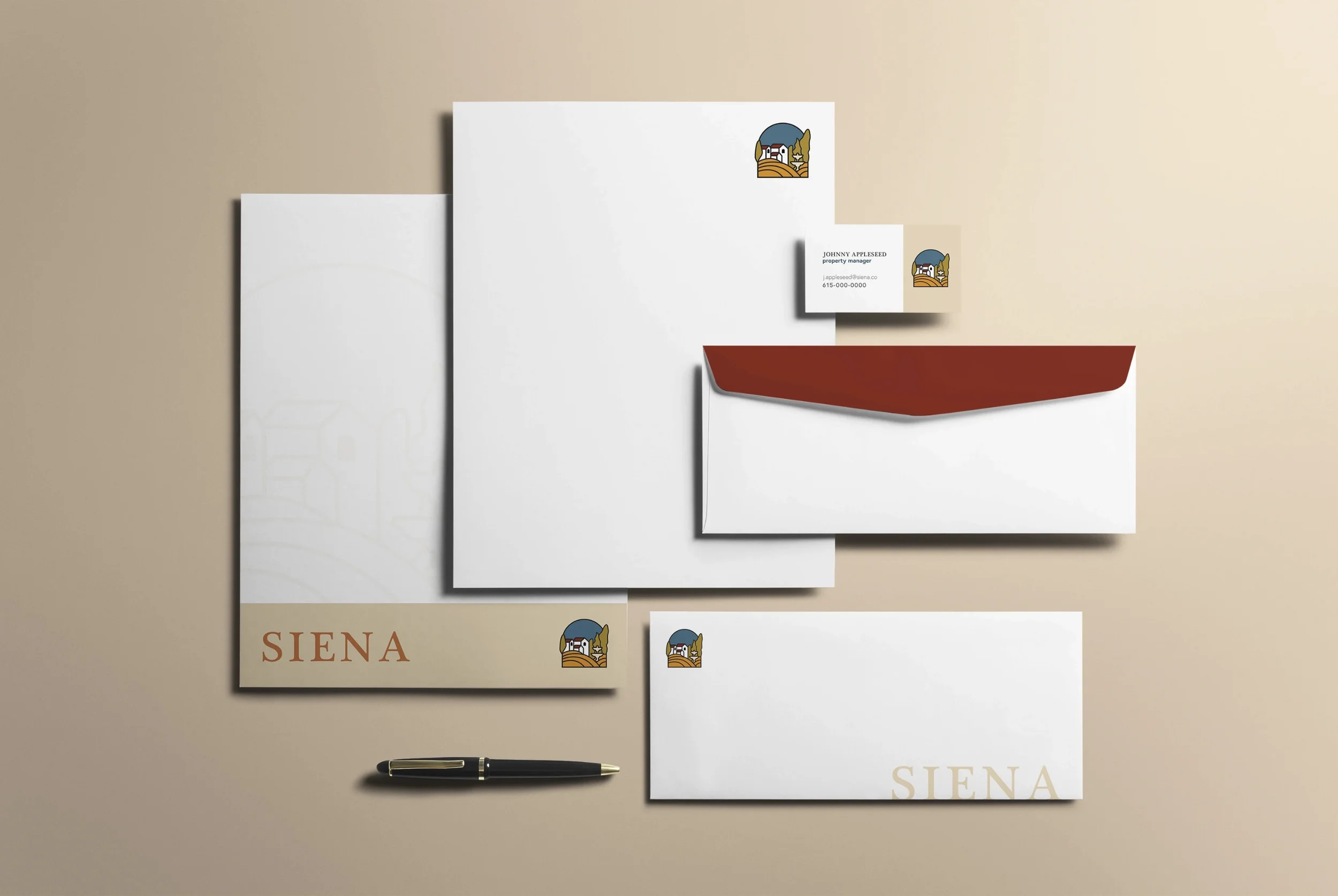
With their romanesque-inspired living, our focus and main goal was on building a brand that represented all aspects of Tuscany within the new luxury apartment space. Research lead us to find that Tuscany was indeed the right basis for our goals, but how were we to bring such a beautiful European aesthetic to a community in California? We focused on the romanesque elements, inviting outdoor enviroments, and an intentional experience.

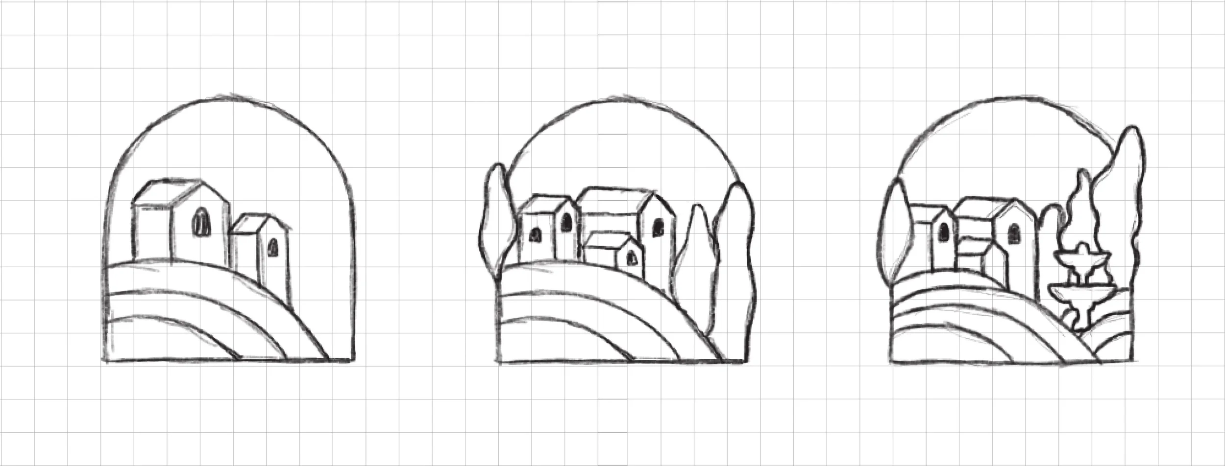
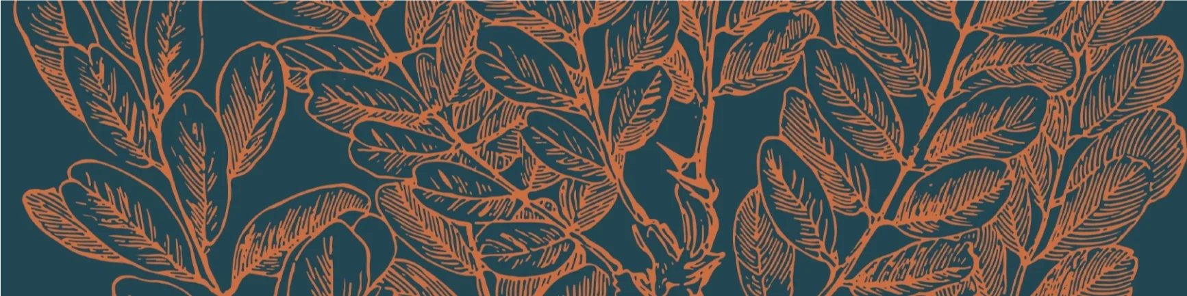
While keeping our main goal in mind, we also wanted to acknowledge the idea of Siena being a close-knit communitiy. We sought to blend the rich historical elements with a timeless experience. A typeface that speaks to "timeless luxury," with warm, muted colors reminiscent of a beautiful Italian countryside. It was important to incorporate imagery that accurately reflected the picturesque rolling hills and idealistic fountains. The logo utilizes soft, yet bold lines, pairing our Tuscany elements with recognizable living area imagery to maintain the importance of a localized, community-centric brand.

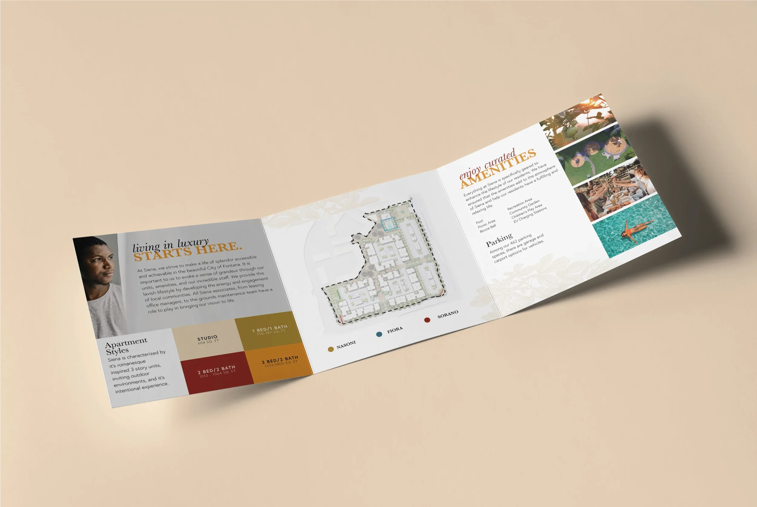

For the three sub communities, we landed on Nasoni, Fiora, and Sorano. We felt that these three names resonated with wahat Tuscany resembles. Not only did the names need to reflect our overarching brand goal, they needed to sound rich in tone when spoken aloud. Nasoni refers to the drinking fountains, which you can find all across Italy; it is to share about the unique romanesque life. Next, Fiora is regarded as one of the most beautiful natural environments in Italy. Lastly, Sorano is a town with rich history and is a picturesque village in the hills of the southern part of Tuscany.